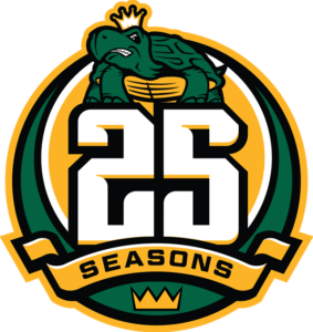
In advance of their 25th season, the Mississippi RiverKings have unveiled a commemorative logo.
“When we sat down to discuss what a 25th anniversary logo would contain, we really wanted to make sure we had an element of every logo we’ve had throughout the years,” RiverKings Director of Business Operations David Schmoll said. “This mark captures an element of each year of RiverKings hockey throughout the last quarter-century in the Mid-South.”
The RiverKings, who began play in 1992 at the Mid-South Coliseum as the Memphis RiverKings, pay tribute to each era of RiverKings hockey in their 25th anniversary logo. The ribbon and crown at the bottom come from the team’s original logo, which represented the organization from 1992 through 2000. From 2000 until 2015, the team donned a green and gold crest, highlighted by the front-facing turtle, which sits atop the anniversary logo. The font used for the “25” along with the gold is part of the new logo package that debuted in July 2015 and designed by Studio 1344.
The 25th anniversary logo will be worn as a patch on both home and away jerseys and will also have it’s own anniversary jersey to be worn during select home games.
Limited edition merchandise featuring the 25th anniversary logo is available now from the RiverKings Locker Room Merchandise Store at the Landers Center or online at RiverKings.com/store.
The RiverKings begin their 25th anniversary season on Friday, October 21 when they take on the expansion Evansville Thunderbolts at 7:30 p.m. at the Landers Center in Southaven.


