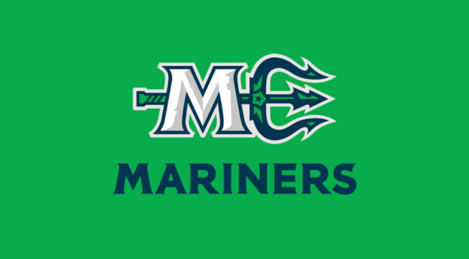
In advance of their debut for the 2018-19 ECHL season, the Maine Mariners are unveiling their logo and color scheme. Owned by Comcast Spectacor, the Mariners will play at Portland’s Cross Insurance Arena, the former home of the AHL’s Portland Pirates.
The logo was revealed at a press conference at Cross Insurance Arena.
“The logo is the team’s main identity, we worked with Big Room Studios to create a strong representation of Maine. We wanted something our team and fans would proud to wear” says VP of Hockey Operations, Danny Briere.
The logo not only has a new look, but has new colors from when the team first played in Portland in 1977. The Maine Mariners’ logo is a collection of imagery and colors that will make fans think of Maine. The logo colors are a nod to the salty blue sea and the luscious forestry that covers much of the state.
Maine is home to 65 historical lighthouses along the shore. These structures help guide the Mariners to safety and the Maine Mariners will certainly be “lighting the lamp” often!
The Dirigo Star is the state motto and is Latin for “I lead”. The M and trident form an ME, which is the abbreviation for the great state of Maine
One of the nicknames of Maine is the Pine Tree State. The center spear of the trident pays homage to the native evergreens.
RELATED STORIES: New for 2018: Maine Mariners; Name the Team Contest Begins for Portland ECHL Team; Portland to Join ECHL for 2018-19 Season


