
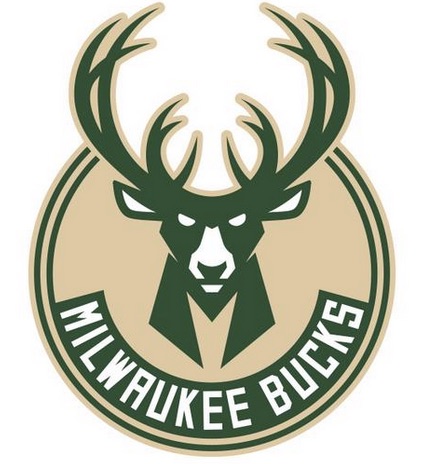
 The new Milwaukee Bucks logos and colors were unveiled at a BMO Harris Bradley Center event, as the fourth iteration of a Wisconsin buck — this one a 12-point buck — and refined colors will define the NBA team next season.
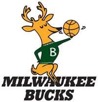
The Bucks began team history in 1969 with a cartoon buck twirling a basketball, and since then the buck has been the centerpiece of team branding, with two subsequent logos featuring slightly angrier bucks in two different color schemes.
 The new logos keep the edgy buck and adds all sorts of iconography. For starters, this is a 12-point buck; the previous buck was only an eight-point buck. (For those outside of Wisconsin and hunting country, a point refers to the tips on the antlers. For hunters, the more points, the better the trophy shot.) The inner antlers are the shape of a basketball, and the inner chevron of the new buck in in an “M” shape, a letter echoed in the secondary logos.
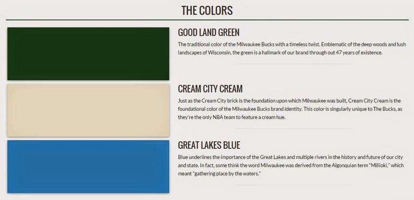
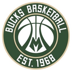
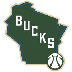 Speaking of the secondary logos: those antlers in the main logo are echoed in the secondary logo (shown second on this page). The M chevron is present here, and the 1968 founding year of the team is celebrated. There’s been a lot of change since the Phoenix Suns and Milwaukee Bucks entered the NBA in the 1968-1969 season, with 10 teams remaining from that season in their original cities (not five, as proclaimed in Bucks materials). Finally, we have a tertiary logo, with a Wisconsin state outline with the Bucks antler basketball shown in the secondary logo. This is the only logo to use all three main franchise colors: green, cream (remember, Milwaukee is the Cream City, thanks to the color of the clay used to create bricks in early city history) and blue. The team was kind enough to tweet an explanation of the colors, as show below.
The new logo designs come from the New York-based firm of Doubleday & Cartwright.