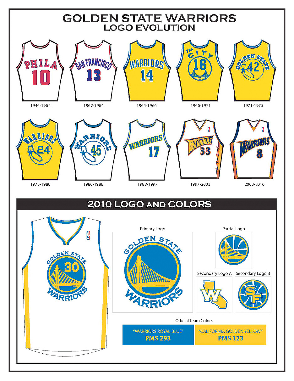
 The Golden State Warriors unveiled a new logo, new unforms and new branding today, as the team embraces its history in the Bay Arena and combines historical elements with a new look.
A silhouette of the yet-to-be-completed Eastern Span of the Bay Bridge is the focal point of the design and a direct spin-off of “The City†logo, one of the most popular emblems in the history of professional sports. Depth was added to the circular band portion of the logo – taken directly from the original model – to provide a modern customization of the graphic design. The simple, yet sleek, design of the Warriors new logo is the result of an 18-month creative and marketing collaboration between the Warriors, the National Basketball Association and adidas – the official outfitter of the NBA.
“This new logo pays homage to our organization’s rich history and unique standing in the Bay Area sports community,†said Warriors’ President Robert Rowell. “The throwback uniforms we’ve worn as part of the NBA’s Hardwood Classics initiative in recent years have been extremely popular with our fans, and we set out to design a new look that was clean and traditional in that same spirit. We are grateful to the NBA and adidas for providing us with a magnitude of creative freedom, along with invaluable expertise, during this process.â€
The logo and brand are built around the two primary colors, Warriors Royal Blue and California Golden Yellow, that have been part of most of the team’s logos and jerseys since arriving from Philadelphia in 1962.


