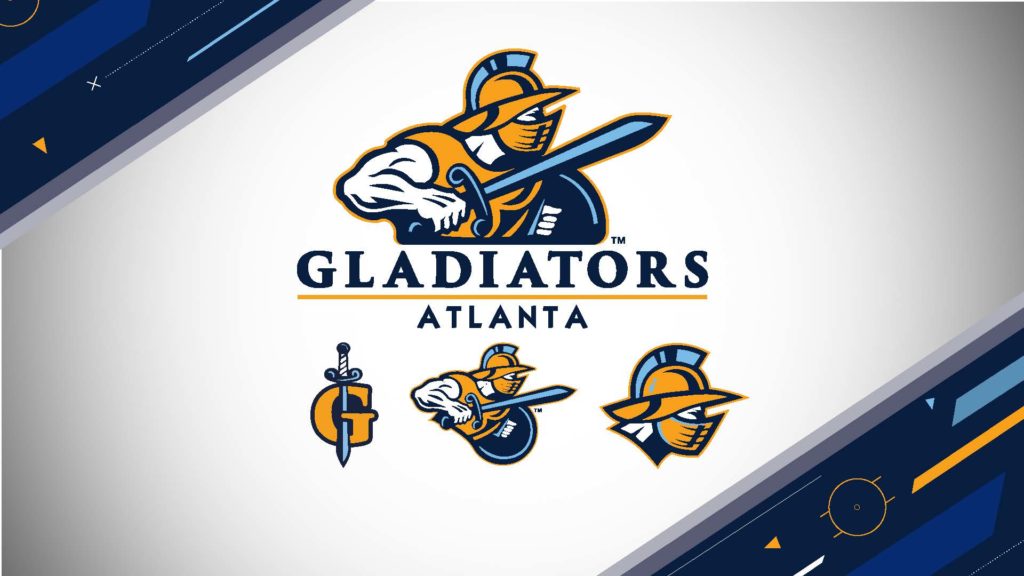
Hockey’s Atlanta Gladiators (ECHL) have unveiled new branding, including updated logos and a refreshed color scheme.
The Gladiators new colors of navy blue and gold are a marked difference to the standard black and red that dominates Atlanta sports, something the team believes will help to create a unique identity for them in the market.
The new image aligns with efforts on expanding the direction and approach of the team’s marketing campaign in the Atlanta Metro Area. It is a far more modern look and appeal, with refreshed logos, a new icon, updated merchandise, as well as game day jerseys worn by the players
“Count on seeing a much bigger presence by the Gladiators in all areas of the community. In order to better connect and stand out with new and existing fans, we needed to have a fresh look that was more appealing to a broader, diverse audience in a youthful market.” said Team President Jerry James.
With the return of Head Coach Jeff Pyle, the team will embody the philosophy of hard-nosed hockey that should excite all fans. Coach Pyle’s commitment to winning is second to none, as his only focus is on bringing the Kelly Cup to the Gladiators and the City of Atlanta. With the Glads being the ECHL affiliate of the Eastern Conference Champion Boston Bruins, who were one win away from being the Stanley Cup Champions, there is plenty to be excited about for the 2019-20 season.
“One of the biggest things for us to be better, was to get bigger and tougher. With that we also added skill and experience. This will be the first team I can remember with four veterans. I think the timing of bringing these guys together was a bit of luck, but it’s a good group and has the potential to be a very good team. I’m very excited to see where we go,” said Head Coach Pyle about his team.

