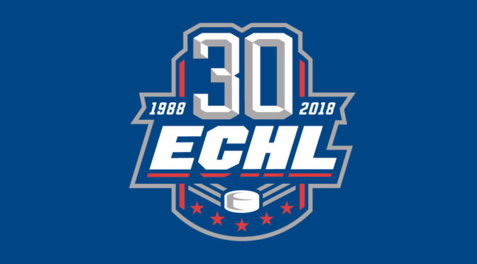
The ECHL is commemorating a significant milestone, as the league has released a special logo for its 30th anniversary season. The league is third-longest tenured professional hockey league in North America behind only the National Hockey League and the American Hockey League.
The logo has the traditional ECHL-styled lettering underneath the number ‘30’ flanked on the left side by 1988 and the right side by 2018.
The logo maintains the traditional ECHL red, white and blue color scheme, along with the decorative stars, which have been included in every ECHL logo since 1988, while also featuring a new look on the ECHL “flying puck.” The five stars in the Anniversary Logo represent the original five teams which took to the ice during the ECHL’s inaugural season in 1988-89.
The 30th Anniversary logo will be incorporated into league and team materials as the ECHL proudly celebrates 30 years of hockey tradition and affordable, family entertainment. The logo was designed by Royer Designs of Toledo, Ohio.
“We are very proud if the history and heritage that has developed over the past 29 years,” said ECHL commissioner Brian McKenna. “Our 30th Anniversary gives us an opportunity to reflect on the past but also celebrate the future. We have many events planned for this year-long celebration which will be announced in the coming weeks and begin when we drop the puck in October.”
The Premier ‘AA’ Hockey League began in 1988-89 with five teams in four states and has grown to be a coast-to-coast league that will have 27 teams in 21 states and one Canadian province in 2017-18. The ECHL is pleased to welcome two new markets for its 30th Anniversary season as the Jacksonville IceMen and Worcester Railers take to the ice for the first time.


