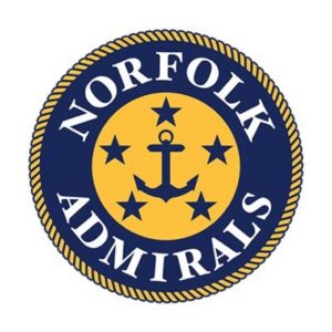
The Norfolk Admirals have made another change, as the club has unveiled a new logo for the 2017-18 ECHL season. This comes just weeks after the Admirals were named the new ECHL affiliate of the Nashville Predators.
Both the team’s original logo from 1989 and the primary emblem of the United States Navy influenced the logo, which will serve as the club’s primary mark effective immediately.
“This is an exciting day for the City of Norfolk, the Waterside District and the Admirals,” president Michael Santos remarked. “Together we revealed the team’s new logo, which marries the tradition of our hockey club with that of Norfolk’s rich military history.”
In specific, the new design has several unique characteristics that continue veteran traditions of the organization and establish new ones.
– A nautical rope is featured around the outside of the logo, embracing yet another tie to the naval region.
– The original 1989 Hampton Roads Admirals logo remains in tact in the center of the new crest, however the navy blue and gold colors have been reversed.
– Five stars signify grade of Fleet Admiral, which was given to the highest-ranking officer in the US Navy.
The team’s new uniforms are expected to be unveiled during the month of July.


